.svg)
No items found.
School Canteen Ordering App- Case Study
In this case study, I will share my experience of creating a canteen ordering app that is designed to simplify the process of ordering school lunches for busy parents.
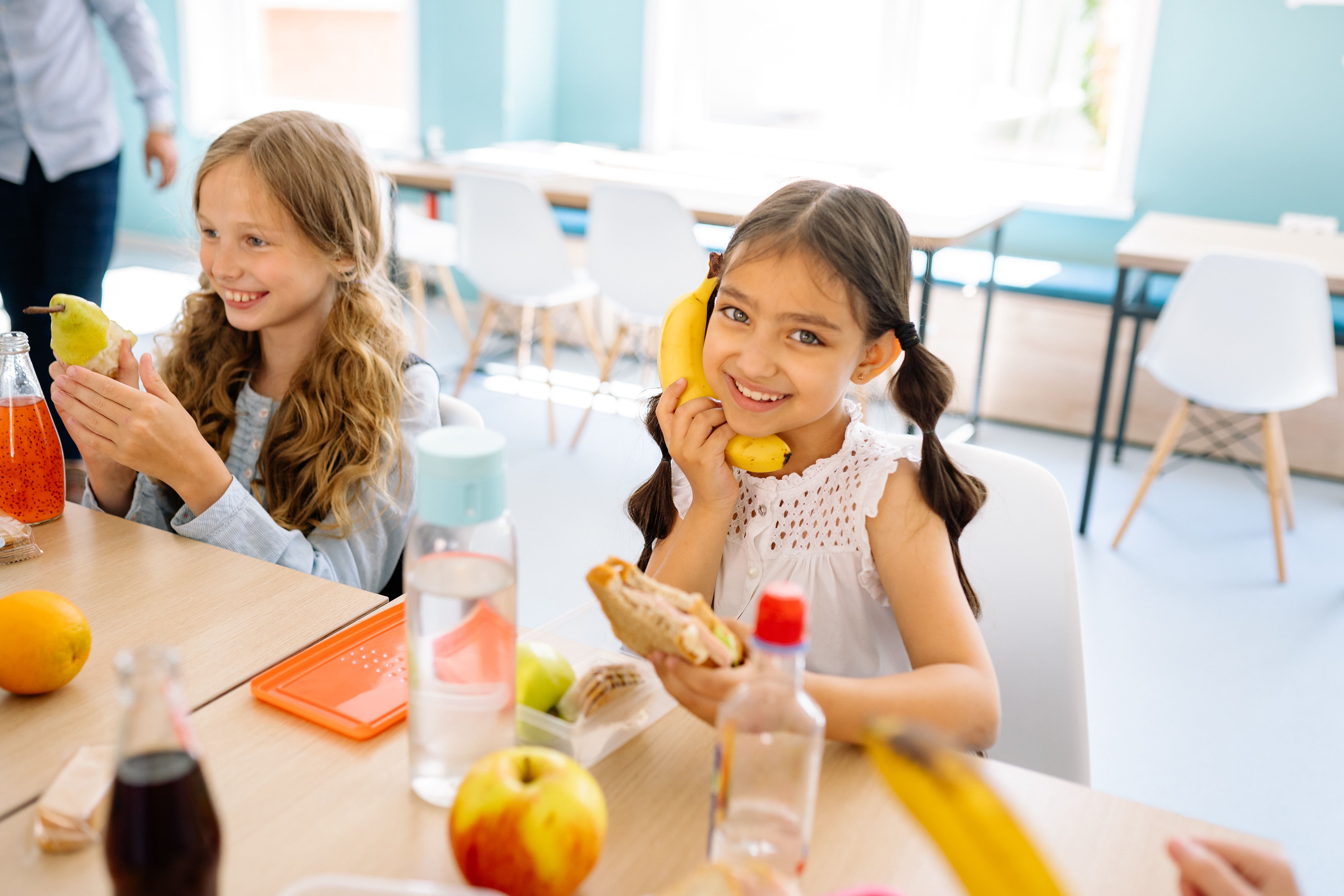
Imagine you have three kids all school aged and you have to get to the office at 9am for an important meeting all while making sure you are ready, your kids are dressed, fed and ready, that they have their books, laptops and instruments packed and everyone is in the car ready to leave by 7.30am in the morning!
Sounds like a dream right? What happens when this flow is interrupted with your kids saying can we have a lunch order mum! OMG.. Now it’s 7.25am you have 5 minutes to find three brown paper bags, find the paper menu list, look for loose change around the house, write the correct order for the correct child on each of the bags and hope that your child gets their lunch order to the canteen without loosing the money and on time!
After this I decided enough is enough and it’s time to talk to other mums and see if they had any of the frustrations. I knew it was frustrating and one that I was excited about and wanted to see if I could improve or change anything to make it better. Or was I overthinking this and was I the only one that was experiencing frustration?
So I started writing down some initial thoughts that I thought could be potential problems:
- Parents not trusting kids with cash
- No customisable options and/or kids with Allergies
- Having multiple credit card surcharges because you have to order separately for each sibling and each lunch and recess separately.
- No Transparency: Images of food are just pretty images so parents don't know exactly what their kids are eating or what brand or packaging looks like?
- Foods don’t have ratings on how healthy they are or the nutritional value
- Kids and parents can’t rate or review the food
- What foods are most popular or frequently ordered.
- Customising the menu so you know how many areas of the food groups you are including in your kids diet and how healthy their lunch orders are.
- No quantity or size of food documented. Images should be of real food they are serving.
- Foods that are most popular or frequently ordered.
- Transparency and showing tick of approval from the The NSW Healthy School Canteen Strategy.
- Customising the menu so you know how many areas of the food groups you are including in your kids diet.
- Slow, clunky and too many buttons to order lunches on the app
- If you have more than one child at the same school or multiple schools you have to order twice and pay twice.
Problem statement
I found starting with a problem statement is a good way to have a goal to be able to come back to throughout the project to reference back to.
My product is intended to help parents have a simple and easy way to order kids lunches from the canteen while having full control and transparency for better health and nutrition and payment method.
I have reason to believe that existing services/products aren’t meeting my goals because the current products have too many steps and are not easy to follow. The options for the lunch menu are not customisable, parents don’t know what the food looks like or what the ratings are and how healthy they are and there are too many payment steps. This is causing parents to be frustrated and is wasting their time.
How might I create a product so that parents are successful in ordering canteen lunches that are healthy and nutritious in an easy and streamlined system?
But then I realised there were more stakeholders than I originally thought, there were:
1. Parents
2. Canteen owners
3. School administrators
Who made the ultimate decision as to how canteen lunches were ordered?
Once I knew this was my focus I started by doing guerrilla interviews by casually talking to other mums at the playground, in parks, at school functions and even at my own personal family functions where the conversations turned to our children and how we used the canteen to order lunches. For me this was a natural way of connecting with other parents who could be raw and transparent with their answers in a non intimidating environment. I also wanted to validate whether my assumptions were valid as a problem area.
I found some interesting insights for casual off the record conversations. Some mums stated they found it hard to think of what to pack for their kids every day and using the canteen was a way for them to not have to think about what to pack. But when using the online ordering systems or even the traditional paper bag method sometimes it took longer then it would if to make the lunches at home themselves.
I also found out that some mums actually worked at canteens and then realised I need to get the perspective of canteen owners and see what was happening on their end. And then this led me to believe that I needed to find out what the school administrators' involvement was in decision making and canteen ordering management.
I decided to have three interview streams (parents, canteen owners, school administrators) and started with the main focus which was finding the problems for parents with the current canteen ordering system.
Interviewing parents
My next step was to have more detailed and structured interviews with parents with the following goals:
- To validate if parents want and an easier way to order school lunches
- Understand current ordering method and if there are any frustrations
- Understand if nutritional value and balanced diet is a concern
So I broke down the questions into groups to support my goal and find out if the parents were actually concerned.
Frequency
Do you order lunches for your kids from school?
Process
What are the steps you take to order school lunches from the canteen?
Nutrition
How do you plan your kids' lunches?
Payment method
Walk me through the payment method?
Is there anything that could be improved to make your life easier?
Traditional:
Do you find ordering lunches from the canteen convenient ?
If there was an easier online option how would you feel about that?
Online system:
How do you customise your lunch order on the app ?
E.g If your kid orders a hamburger and doesn’t want sauce
Does it support allergy kids
How easy is it to schedule lunches ahead of time?
Do you have any concerns or challenges with the online app that you are using to order school lunches?
I decided to choose parents that were from different schools and had different ways of ordering. Also different aged kids and some with one child and some with multiple children. Some were still using brown paper bags and some parents' schools were using online ordering apps. I thought this would give me an overall understanding and different points of view. It was great that so many parents were happy to catch up and willing to give their opinion and insights in the interview. I facilitated 5 interviews, some were face to face and some were through zoom.
What is the brown paper bag system? This is a traditional way of ordering school lunches the way my mum did when I was at school. You basically write down on the paper bag what your child wants from the canteen menu with the money inside the paper bag and then your child takes it to the canteen and collects their order at lunch time.
How the interviews went - parents
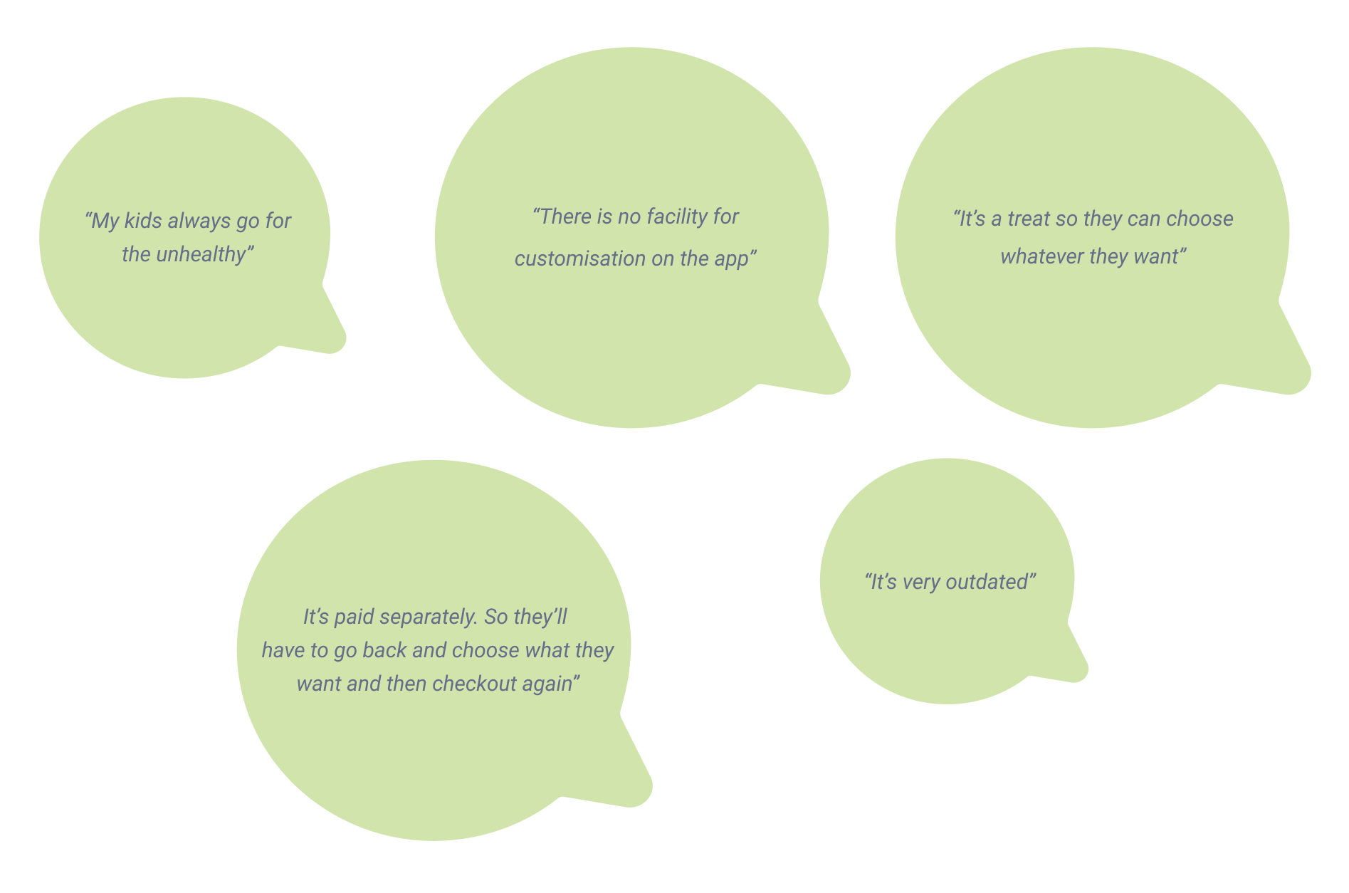
What I found interesting after the interviews was that most parents cared about the nutritional value but that wasn’t the biggest concern because their canteens were generally healthy enough and most used the canteen as a treat anyway. Also surprisingly most weren’t fussed on too much detail regarding nutritional value and star ratings, the main thing was that they could see the ingredients so they knew what went into the food and that they could order quickly, efficiently and have control and transparency of their payment method.
Here were some comments and insights that stood out to me:
Interviewing canteen owners
I then found two willing canteen owners that were happy to do an interview.
The goal for the canteen owners interviews was to:
- To validate if the school/ Canteen owners want and an easier way to process school lunches
- Understand current order intake method and if there is any frustrations
- Understand is having a healthy canteen important?
Some non-leading questions I asked were:
- How do you get your menu out to the parents?
- What systems do you use or have used in the past?
- Can you compare the different experiences?
- How do you receive payments?
- Do you have any other concerns or challenges with your ordering method?
- Is there anything else you’d like to suggest or anything that could make your life easier?
How the user interviews went - canteen owners
The first interview canteen owner one was face to face and she allowed me to meet at the school canteen where I facilitated the interview. But it didn’t go to plan and this is why...
I had the feeling that she thought I was an auditor or I was sent from a government department to investigate her processes. She was very cagy with her answers and it was hard to navigate due to the language barrier too. After a few questions I decided to soften up my questions and reassure her that this was for the purpose of finding out if she is having any problems with canteen ordering and whether there were any improvements that could be made.
I still didn’t get much feedback except mostly the same answer to all the questions. That it was a good system and she was happy with it. Well maybe on her end she was happy with it. I thought I’d get one more canteen owner's opinion before I decide if the most important problem to solve was for the parents or the canteen owners.
The second canteen owner I approached was interesting. She was concerned about not being prepared for my questions and wanted me to send her a summary of all the questions I was going to ask her before we did the interview.
I didn’t expect this because I wanted her answers to be natural and more of a casual conversation about her thoughts and feelings. I still sent a few brief questions as I didn’t want to overwhelm her but it didn’t affect the interview very much because she said she didn’t get a chance to figure out her answers before the interview.
I conducted this interview by zoom and while on the call could hear another voice in the background that was influencing the responses. I asked who the person in the background was and it was the other business owner. So I asked her to join us because her insight was just as important. I went from interviewing one to interviewing two of the business owners which made them both feel comfortable and willing to share more insights.
Main thing I got is they changed from one app system to another because the previous one always crashed on busy order days when they were in the middle of making the orders. So they changed systems.
I then decided it would be a good idea to get the experience of a school administrator and see if they had any interesting insights.
The interview goals for the school administrators
- To validate if the schools want an easier way to process school lunches
- Understand current order intake method and if there is any frustrations
- Understand is having a healthy canteen important?
My main interview guide questions for the school administrators were:
- What systems do you use currently?
- How long have you used this system?
- How have lunch orders been done in the past?
- Can you compare the different experiences? systems/methods/apps
- How did you find out about this app?
- Why did you choose this system?
- Is there any costs involved for the school or do the parents pay?
- What is the school's role when it comes to canteen lunches?
- How do you get your menu out to the parents?
- What about what is actually sold at the canteen physically during lunch and fruit break?
- Do parents know what their kids are buying?
- Who chooses the menu items? Does the school know what the items look like?
- Is nutrition value important?
- Who sets the pricing?
- Do you have any challenges with parents using this ordering method?
- Is there anything else you’d like to suggest or anything that could make your life easier?
How the user interviews went - school administrators
I conducted one interview over the phone and one in person.
The one over the phone was spontaneous and unexpected as I was ringing to book in time for the interview but the participant was happy to go ahead and do it on the phone immediately. I wasn’t fully prepared but I managed to do the interview on the fly and get a good result.
The second interview with the face to face school administrator was good. We got chatting and I got some insights and half way through the interview she called the school principal in to join our meeting to see if she wanted to add anything. I thought that was really nice and they cared about my mission. The main thing the principal added was the frustration with not being able to customise the menu item. i.e. if she didn’t want tomatoes or or wanted to choose a different type of bread. So she would then have to ring the canteen lady to make the change instead of using the app.
Some challenges during user interviews
- Staying focused on the questions
- Not giving my own personal opinions
- Keeping questions open ended
- Limiting probing questions that end with a “Yes” or “No
- Being able to be fluid with the order of the questions
- Allowing the interviewer to go off on a tangent but then bringing them back to the questions
- Parents getting distracted on zoom calls by interruptions
- Doing some interviews by Zoom meant I couldn’t see how they were interacting with the app they were using visually
My initial impressions after interviewing all stakeholders
I noticed the face to face interviews were more responsive. I was able to do the warm up questions more thoroughly and make them feel comfortable before I started my interview.
They could show more expression and body language as well as show me physically how they ordered and I could watch first hand their user experience. Some interviewees wanted to know what other interviewee’s answers were and if they had the same thoughts.
It seems that the canteen owners and admins were unaware of how the app interface is viewed and used by parents, who are ultimately the client. Even though there were not many frustrations on the back end of the system for the canteen owners and school administrators, there were plenty of frustrations for parents using the app to order. Interestingly some parents didn’t realise the app is not actually the canteen company but just a platform to order from that the canteen owners use.
Also one of the school admins didn’t know how the parents use the app and didn’t test the app themselves before implementing. They just went with it because the canteen owners prefer to use that particular system. No training from the platform company was provided or called upon.
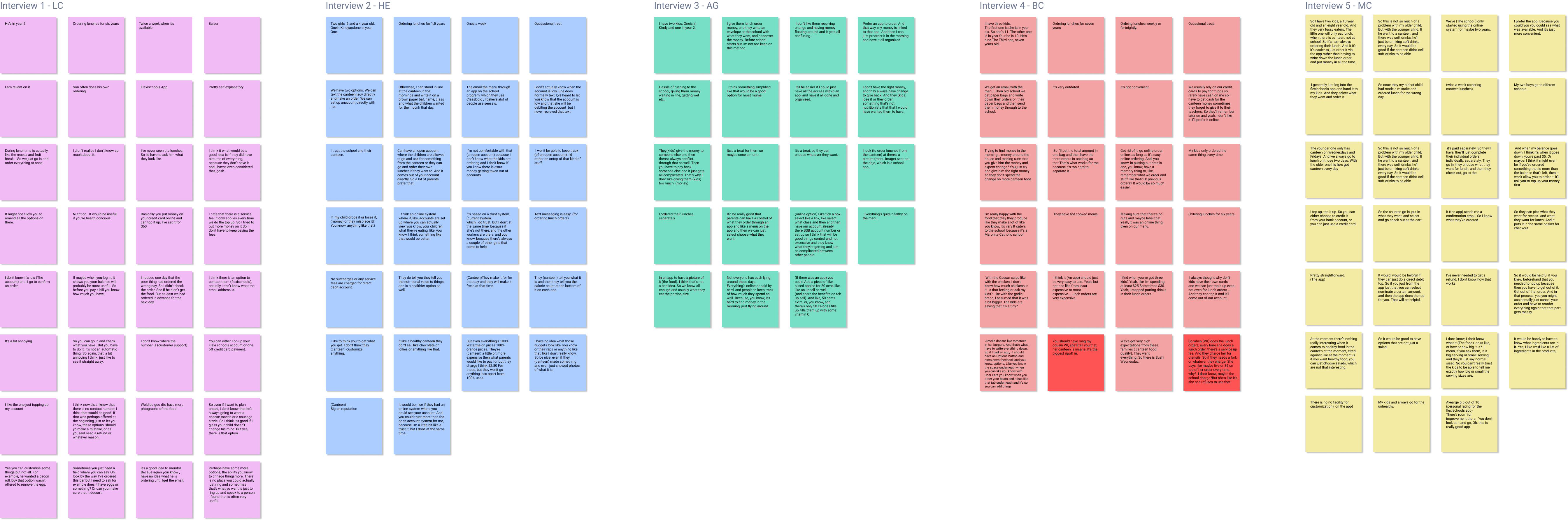
Interview research and analysis
After facilitating all the stakeholder interviews there was an abundance of information and insights that I was given in a short period of time.
I had a particular process for each interview because some days I did 3 or 4 interviews and taking everything in was important.
My analysis process for each interview was:
- Record the interview
- Write notes immediately after each interview
- Transcribe each interview
- Read and take notes and highlight main points
- Write a short summary of the main points of each interview
- Write down each point on a separate sticky note. Each interview was a different set of colours
After interviewing and dissecting all the information from the three groups i.e the parents, canteens owners and school administrators, I decided at this point it was time to focus on one group.
I focused primarily on the parents group due to the time frame of the project and because I felt there were a lot of frustrations that needed to be addressed and analysed further.
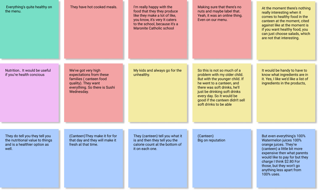
Affinity mapping - parents
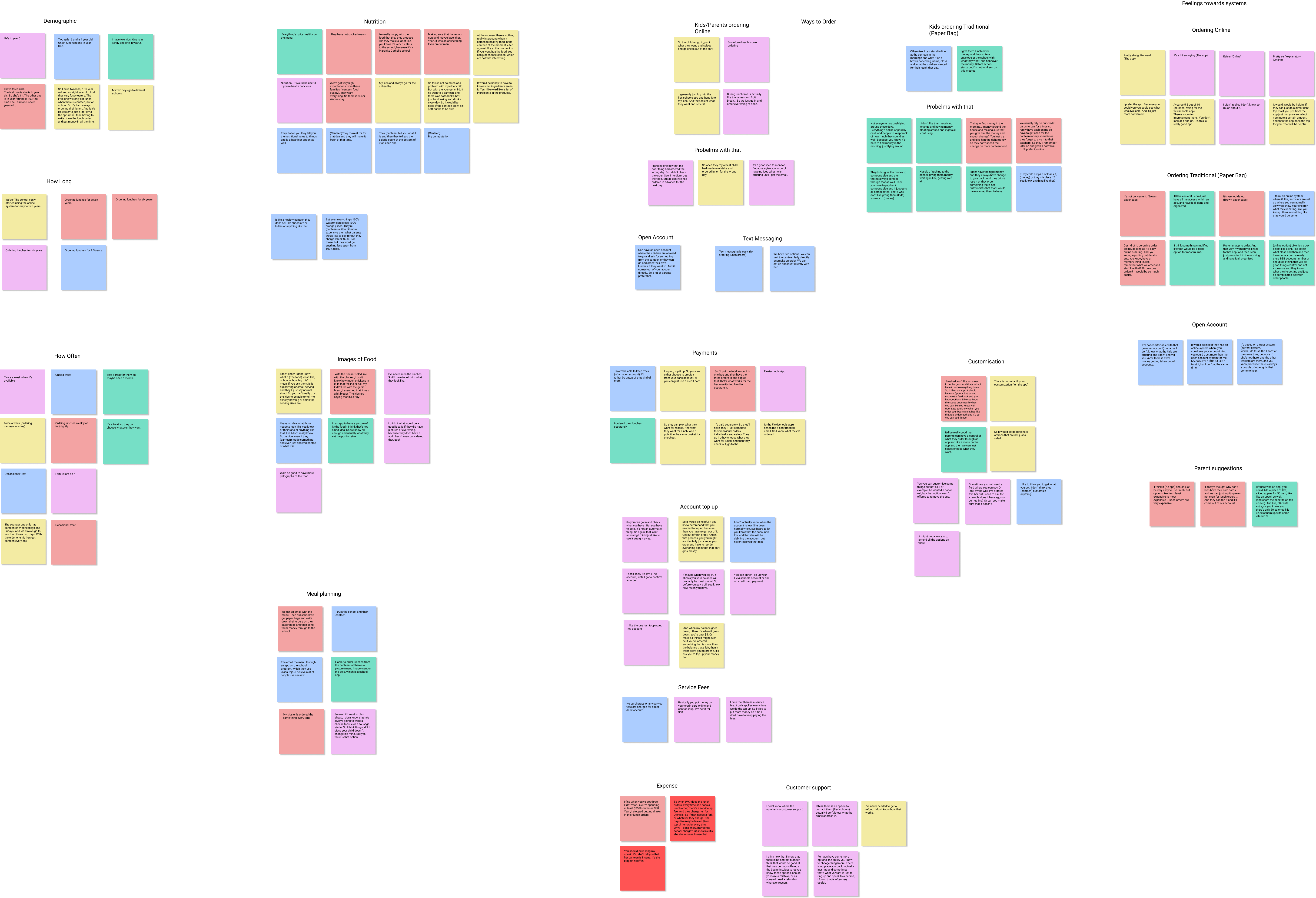
From here I went deeper and started affinity mapping. I categorised all my findings further into sticky note topics and then was able to work out if there was a pattern in what the parents were saying. Were there any similarities or differences? Did anything major stand out? Also by preserving the language that the participants used, I could understand their intuitive answers and thoughts which helped me analyse any patterns across other participants.
After this process and grouping the participants sticky notes multiple times and chopping and changing their locations to different categories, naturally some themes started emerging and a relationship between the participants' similarities and differences started to appear. The key themes that emerged in the diagram below.
Persona creation
Based on the multiple groups and insights from affinity mapping, I decided I needed to have a stronger focus on who the participants were that I observed and interviewed.
Creating a persona was an important next step for me as it was a good communication tool throughout the project that I could quickly refer back to when needed.
.png)
So everything I discuss next is based on finding out how I can make the user journey easier, more enjoyable and convenient online.
Which is why the next step for me was to create a prioritisation map.
Prioritisation map
Using the prioritisation map, I laid out the most impactful findings from the proto persona.
I arranged and organised what was of highest value and easy to implement while adding some difficult features that were of high value that could be built within the short timeframe of the project.
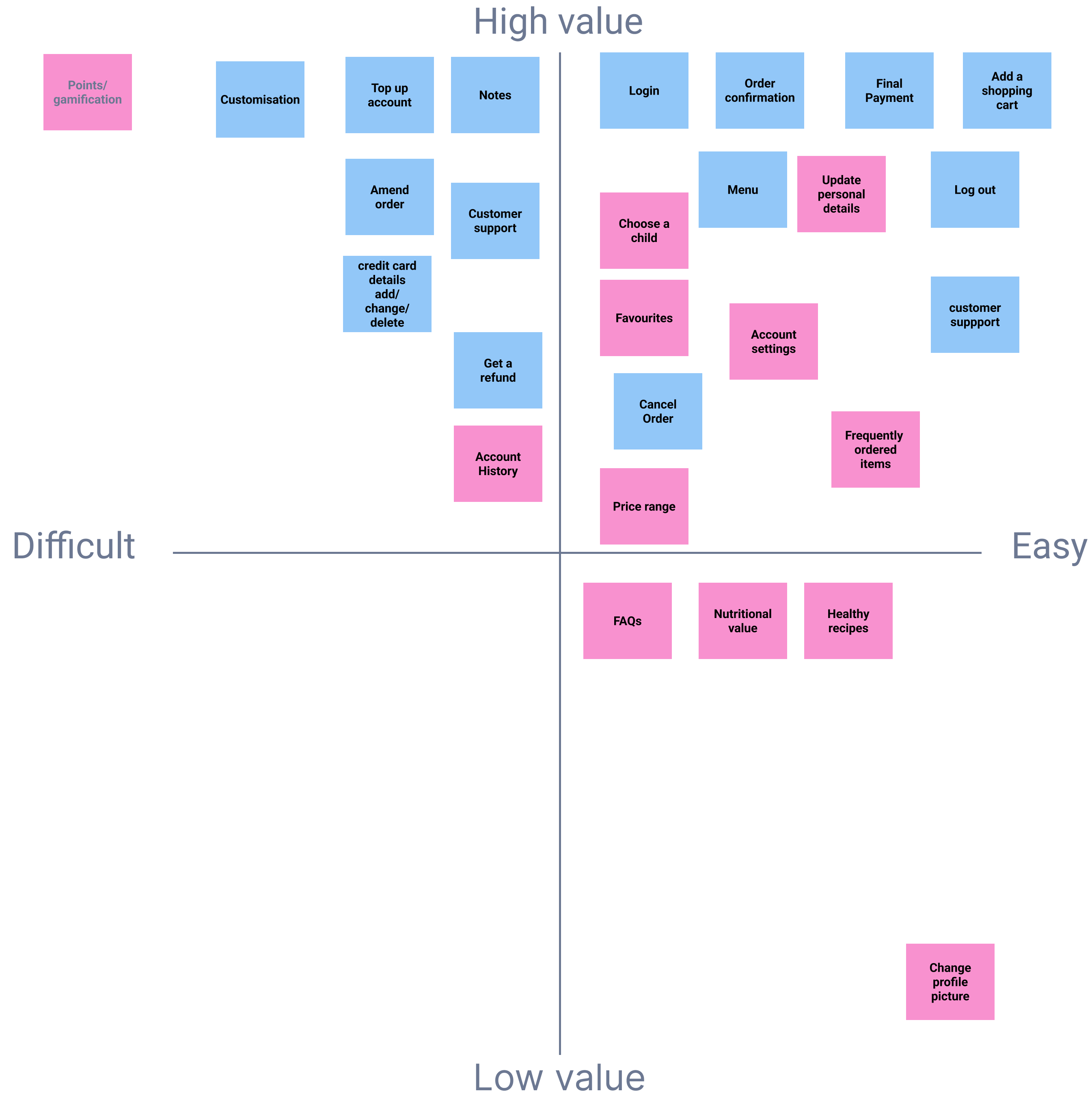
It became evident that the top priorities for the MVP were::
1. Simpler way to order for multiple kids
Most parents with more than one child were frustrated with the current app because there were too many steps to order. If they had to order for more than one child they’d need to order for one child, pay and confirm and then go back and start again to order for the second child, pay and confirm and so on.
2. Customisation of items on menu
Another high priority was customisation. If a parent ordered a sandwich for their child but didn’t want butter, there wasn’t a way they could put a note in or select an option for no butter. This process was very time consuming and some parents said they avoided ordering anything that they had to customise for their child to make it faster.
3. Favourites section for easy repeat orders
Some parents said that there was no place to put their child’s frequently ordered items. These children tended to order similar things at each order and it would make life easier if they could just click a button and order from a section like this
Design process
User flow
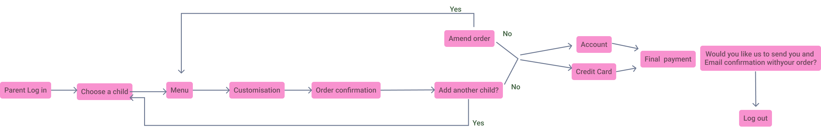
Based on my research and analysis of MVP, I created a user flow to show the process of how parents would order a canteen lunch order from start to finish.
This helped me focus on the MVP and illustrate what it was I needed to design. It also helped me pick up on any challenges early and it was a good communication tool when talking to others involved on the project.
Inspirations
Before jumping into ideation and sketching potential designs for specific features, I felt that I needed to find out more about what solutions existed in the market.
How was the digital experience for parents from a heuristic point of view?
With this in mind, I decided to take screenshots of two main competitors on the market and do some further heuristic evaluation.
I wanted to experience for myself what users were going through, what was working and were there any pain points or areas for improvement.
For example:
- How many steps were needed to order a lunch?
- What areas did the user get stuck?
- Was there too many steps for a simple task?
- How many ways could the user get to the end result?
- How easy was it to find what you were looking for?
- How long did it take to order?
My main findings after evaluating other apps:
- Too many repetitive clicks when making an order. For one app it took three clicks to confirm the order even before going to the payment page. i.e confirm order, place order, press ok.
- Ordering for more than one child meant you had to go through all the steps and pay for the order and then start again for each consecutive child.
- Finding a customer support area wasn’t clear
- There was no option to customise an order or write notes if something specific needed to be changed i.e if your child hates tomato on his sandwich order , there’s no area to say, take this off.
I continued my research by comparing other ordering apps from across different industries and took screenshots and mapped out the different flows. This included delivery ordering apps, supermarket ordering apps, recipe making/storing apps as well as ways that shopping carts were implemented in online shopping apps. I looked at their best practices and what I could learn and use for my canteen ordering solution.
Ideation
At this point I felt it was time to put some crazy ideas down on paper by brainstorming and sketching some draft concepts. I always like to start off with pencil and paper before I digitise anything. I feel it allows my creativity to flow especially when I’m in the ideation process.
This was my ideation process:
- Summarise key notes from all the information gathered so far
- Rough sketches of some solutions
- Crazy 8s to come up with concepts quickly - 8 ideas in 8 minutes
- More detailed solution sketches
Some ideas I came up with:
- Kids have their own accounts linked to parents account
- Kids can see what their friends order
- Kids and parents can rate the food and give it a review
- Gamification - The child can pick their avatar, walk through the world like a game to order food from the canteen and then earn points for picking healthy options. The points are redeemed for a voucher at the canteen.
Hand sketches
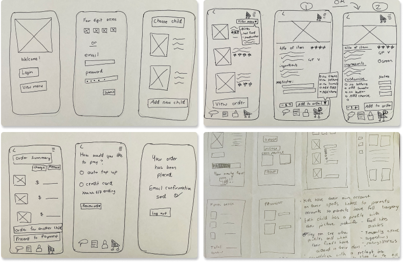
I started with some very rough hand sketches to get a look and feel for my user flow that I previously mapped out. I wanted to get every mockup out even the silly ones down on paper to try and make sense of my thoughts.
The sketches kept evolving and I tried different layouts and alignments of photo and descriptions boxes, navigation and ordering for multiple children and profile pages.
I tired to understand what were the main features that needed to be in the navigation area? What was the path between the pages? Can I make the steps shorter and quicker?
I tried different versions of the same page to see which one felt more intuitive. For example with customisation I tried a pop out box compared to a list and tick box.
Low Fidelity Wireframes
From here I uploaded my hand sketches into Figma and turned them into low fidelity wireframes in order to illustrate the main features and see the functionality. I created two versions that evolved from the hand sketches. They were a good communication tool when explaining my ideas about the interface and details to other designers and developers.

I started fleshing out the ideas and adding more details creating some High Fidelity Wireframes focusing on my main properties of the MVP:
- Simpler way to order for multiple kids
- Customisation of items on menu
- Favourites section for easy repeat orders.
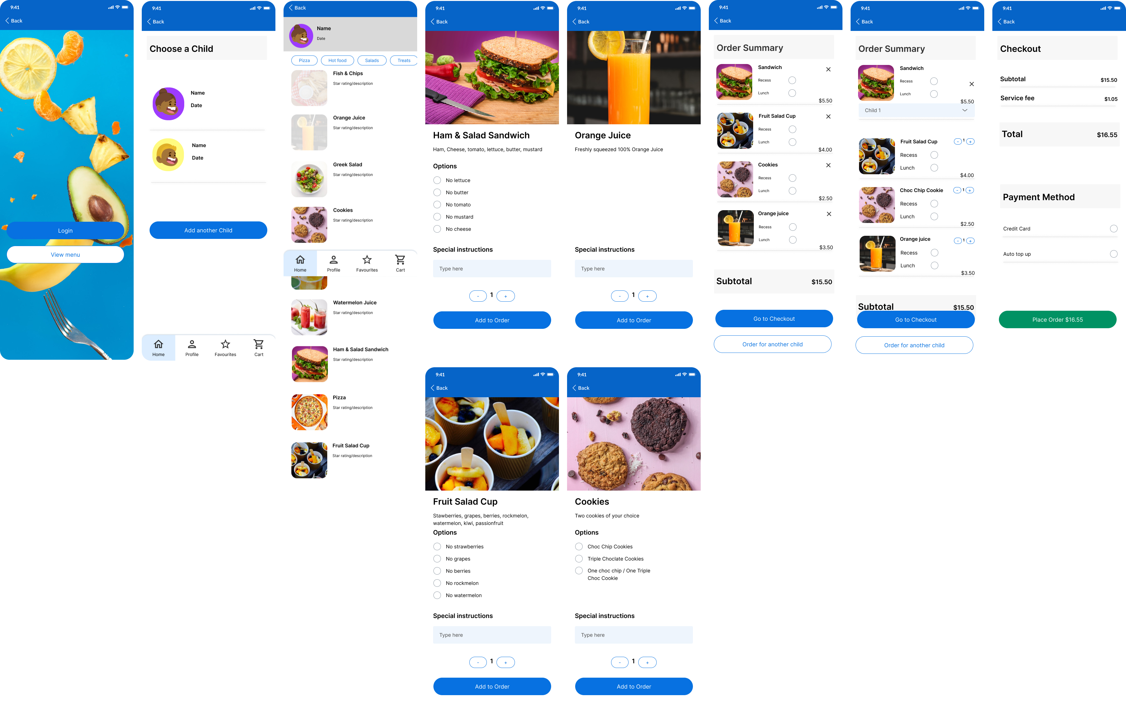
I also started to look deeper into colour combinations and finding inspiration on colours and typography that I liked. I wanted the look and feel of the app to be fresh looking, not too serious yet organised and functional. I tried a few colourations but then chose a fresh green colour representing freshness and healthy food which I thought would be appropriate for a canteen ordering app.

I tried different versions and made sure there was consistency in the page layouts. I chose a final wireframe option that I thought would be most intuitive with the user. The next step was to see if the flow from each feature was functional. I created some wireframes around each feature to see if there were any areas that needed to be smoother when moving through the pages and making decisions.
At this stage I needed to create a clickable prototype. Even though the wireframes looked nice, I needed to check what the interactive experience and functionality. There was no use in having a nice design if it wasn’t going to serve it’s purpose and create a solution.
User Testing
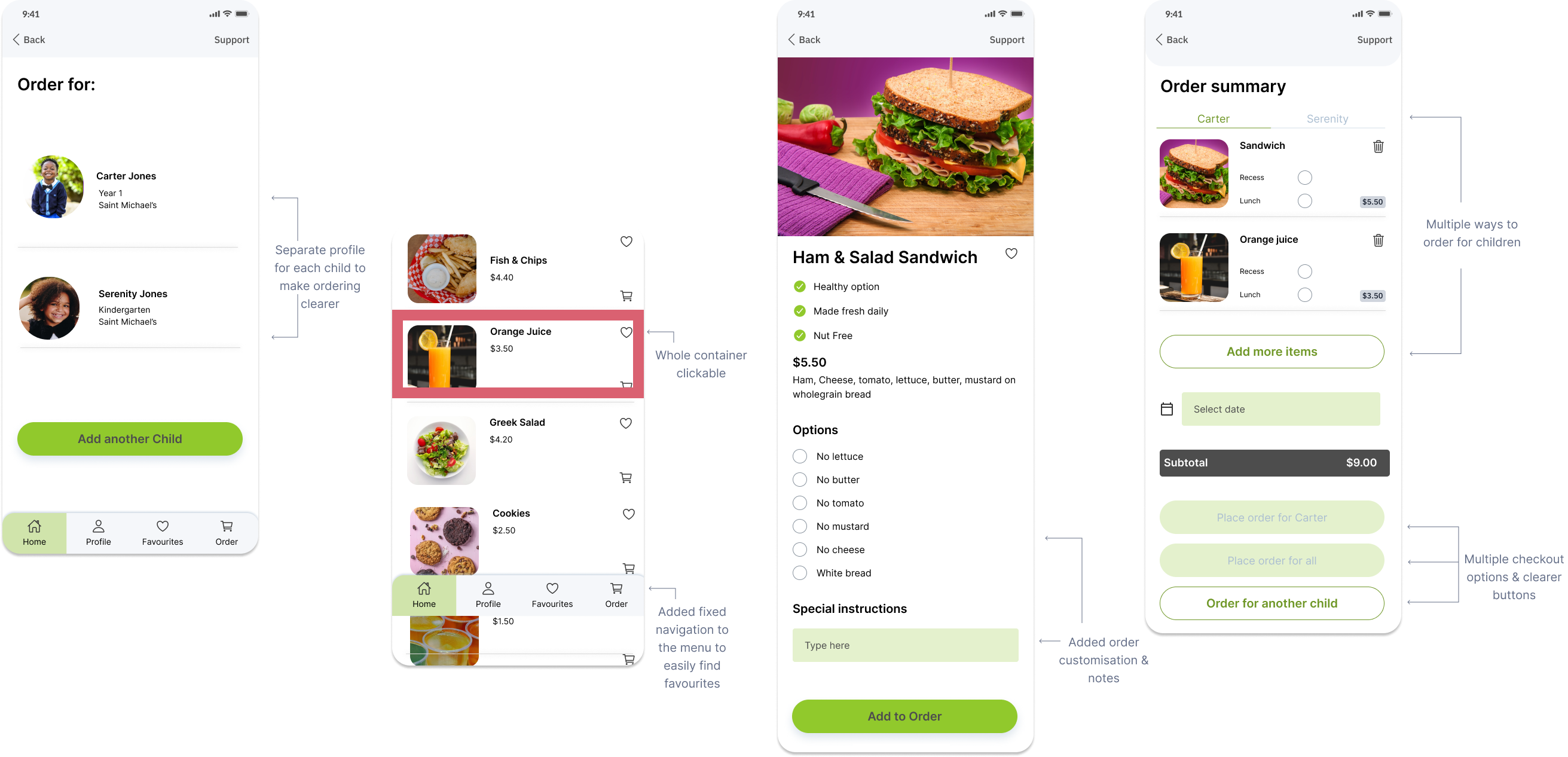
At this point I was happy with Version 1 Prototype and decided to do a quick test on one parent before further user testing. After this initial test, I realised I had to make ordering for the second child clearer and easier. The problem was when you get to the order summary, it wasn’t clear that you had to scroll down to the bottom of the page and order for another child. So before continuing testing on more users, I made some adjustments to help make it clearer. This included having two ways you can order for the second child.
.png)
User Testing V1 Prototype
I did further qualitative user testing on another four parents and one child on my first prototype. Each test took about 10-15 minutes. During the test I prompted the participants to talk out loud so I could hear their thought process, stayed neutral so I didn't influence their decision making and I encouraged the participants to show me what they were doing, not just verbalise it.
The questions I asked during user testing were:
- If I wasn’t here what would you click and why?
- Is that what you expected?
- If you downloaded the app on your phone show me what your next steps would be?
- What do you think the app is about?
- How do you expect to use the app?
The tasks I set during user testing were:
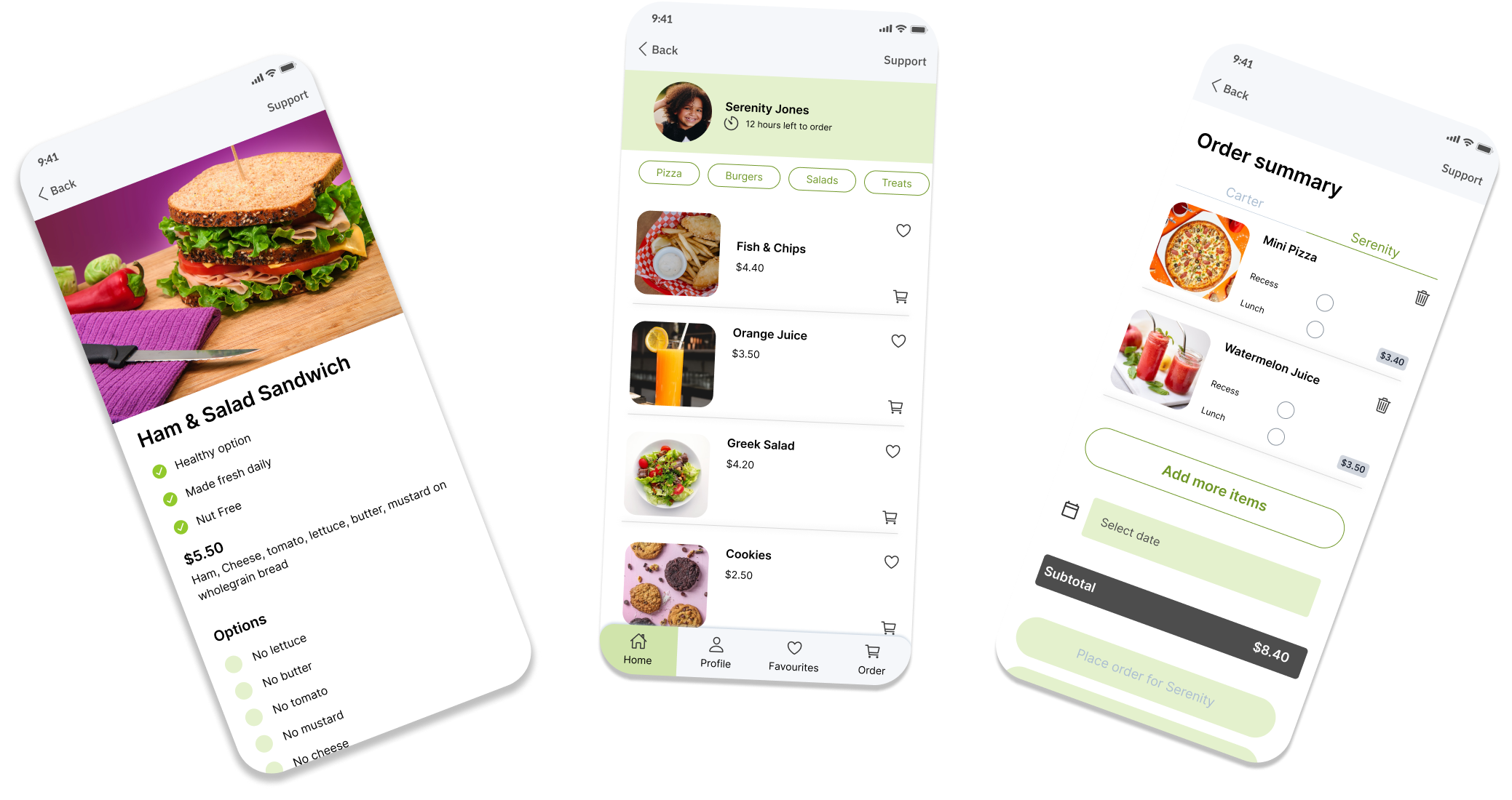
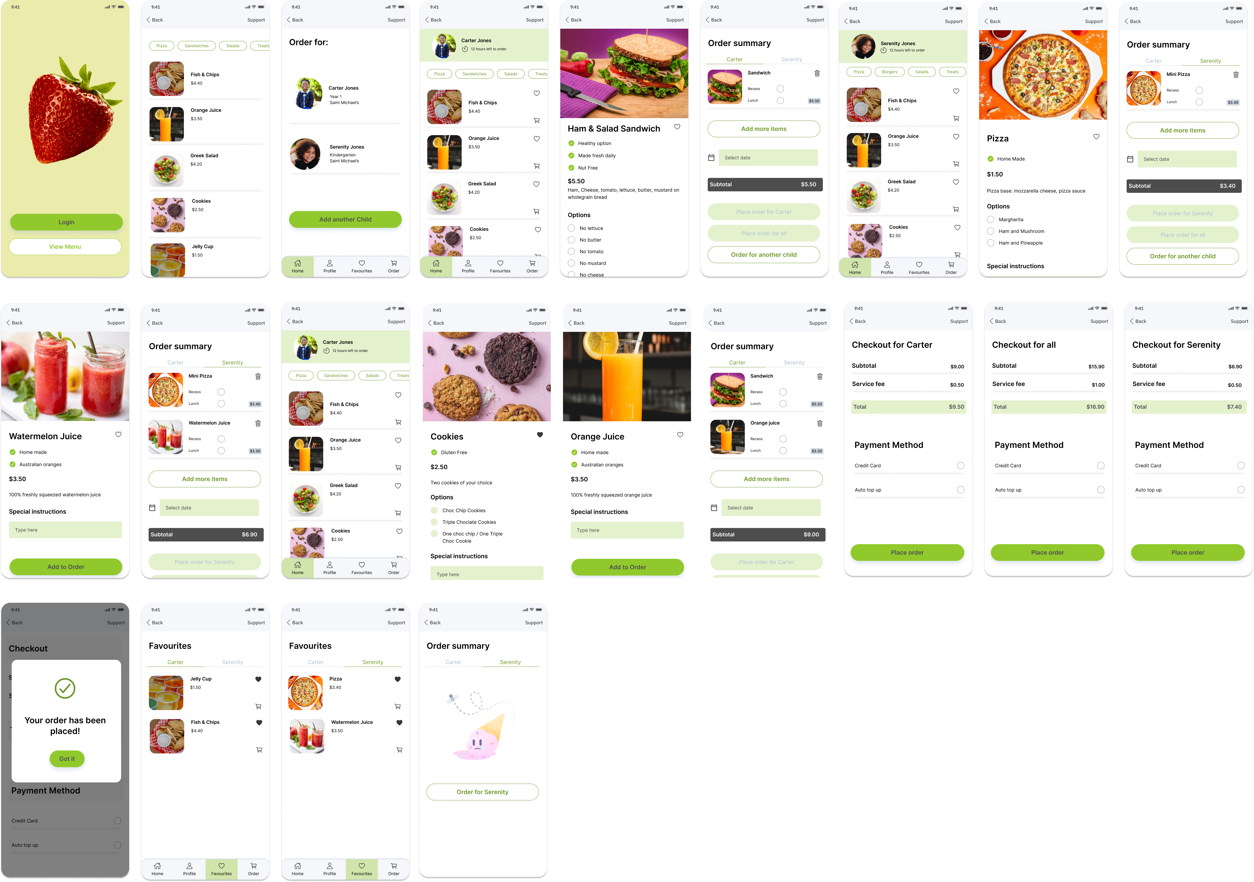
(Note: My sample children in the app were named Carter and Serenity)
- Show me how you would view the menu without logging in?
- Show me how you would login and browse Carter’s menu?
- How would you add jelly cups and fish and chips to his favourites?
- How would you view all of Carter’s favourites?
- Show me how you would browse the menu for Serenity?How would you add Pizza and watermelon juice as her favourites?
- How would you view all of Serenity’s favourites?
- Show me how you would add orange juice to Carter’s order?
- Now show me how you would add a sandwich to Carter’s order with no butter?
- Now how would you order a ham and pineapple pizza for Serenity?
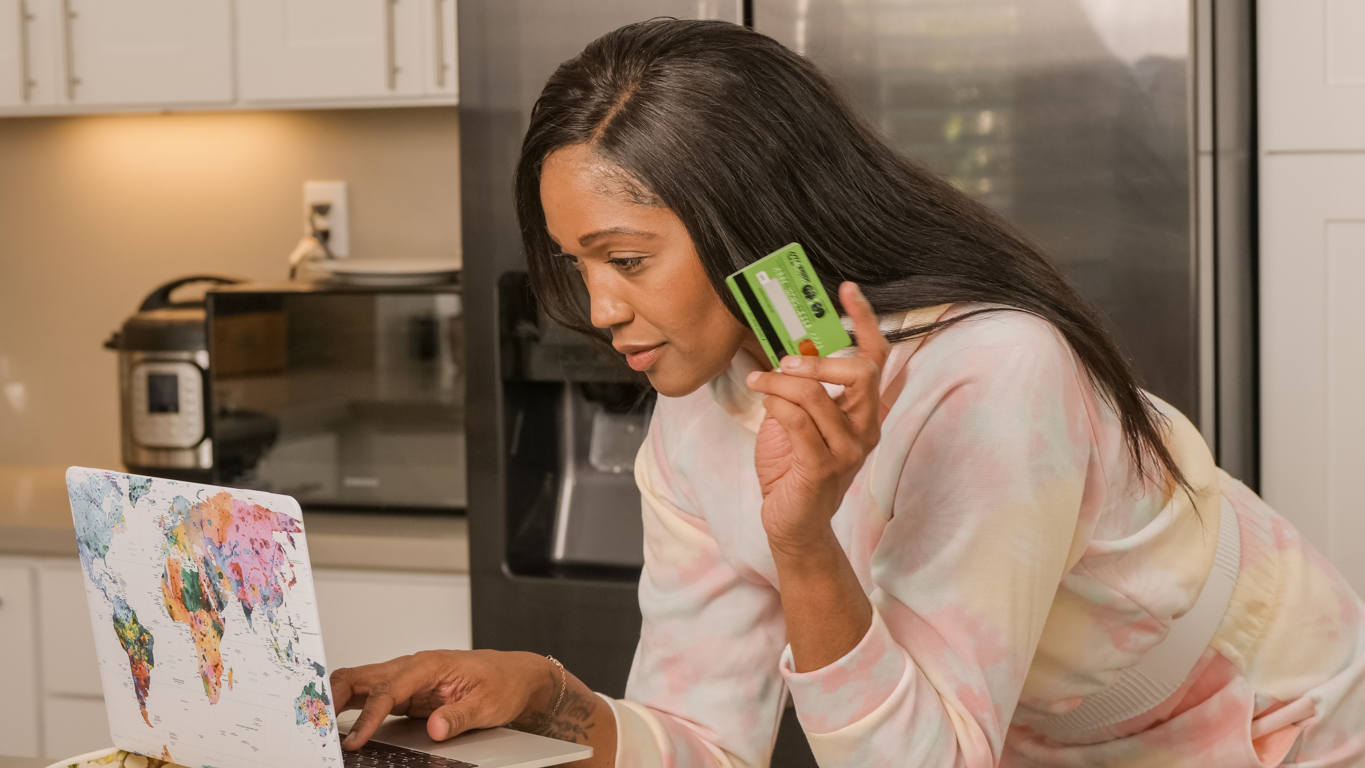
- Can you now pay for the items by credit card?
User Feedback
1.Loved that it was simple and clear to use
2.Shortcuts for adding to cart
3.Multiple ways to order for second child
The way I’ve designed the app is to be able to go into each child’s profile and see the main menu from there.
My findings after V1 prototype user testing
- In this first version shown to users most thought you could click on the child’s profile and find out info about favourites, order history, payments methods etc..
- When adding an item menu from the child’s profile most are clicking on the shopping cart icon.
- With the menu item button, only the picture was clickable and most were hovering over the words. ( next version made the whole area clickable)
- Adding a favourite is easy but finding the location of favourites was tricky.
- Most users tried to click on the profile of the child to find favourites.
- Next version I will make the profile point to favourites
- In profile section for phase two will add order history, payment methods etc.. and keep building on the profile page.
- Some users are used to a certain way to order. Once they understood how the app works they found it easy and simple to use.
Interestingly I tested the product on my child and out of all the adults, he was the only one who did not have any frustrations and did the task I asked him to do with ease. It’s interesting because they are the next app generation and I assumed if there were any frustrations he would surely point them out. This was a great insight as some parents login and give their phone to their children to place the order.
V2 prototype with improvements
I made some changes from observing the user behaviours and also from the feedback I received in my initial V1 prototype user testing.
Like for like test with a competitor:
I decided to take my testing one step further and compare my V1 prototype to a common competitor on the market that is used by many schools.
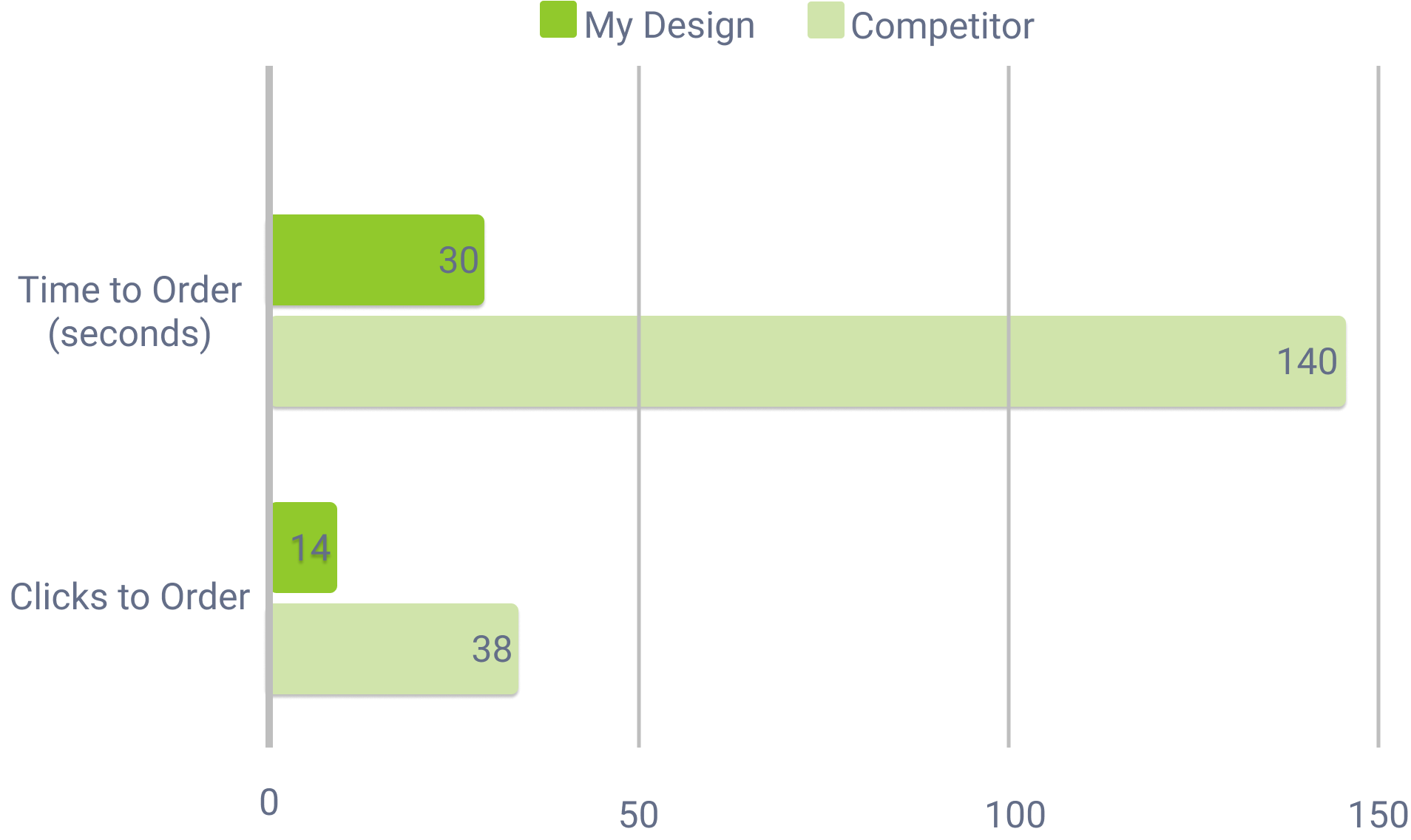
So I did two tests: The first was I timed how long it took to order two items (with no customisations and assuming the child already decided what they want) for two children from login to checkout confirmation. It took me 140 seconds with the competitor compared to 30 seconds with my V1 prototype.
The second test I did was how many clicks it took from start to finish to complete the order for two items and two children. Interestingly the competitor was 38 clicks compared to 14 with my V1 prototype. This gave me confidence to show that I have made some measurable improvements in terms of speed and efficiency when ordering canteen lunches using my app.
Name of app
I didn’t have a name for my app throughout the whole process and while working on version two of the prototype.
I decided to call it ‘Tuck Shop”.
This was a common slang term used for the school canteen when I was growing up Sydney, Australia.
So I thought why not have some nostalgia in a modern ordering system?
Live demo
Conclusion
My main intention with the creation of the “Tuck Shop” app was to deliver a product that was easy to use, functional and an enjoyable experience for parents.
I feel I have eliminated many frustrations and annoyances and focused on three MVPs:
- Simpler way to order for multiple kids by allowing options to order for other children while all in one order. Also minimising the amount of clicks from login to order confirmation.
- Customisation of items on menu by adding a notes section under each item menu and providing tickable boxes for possible changes to each item.
- Favourites section for easy repeat orders by adding a favourites section in each child’s profile. So you can order straight from the favourites instead of going through the whole menu each time.
The product will continue to evolve and I will add more features including:
- Order history
- Credit card detail
- Healthy food ratings
- Frequently asked questions
- Contacts page
- Reviews from parents and kids that are visible to other parents and children in the community
For the future phase I intend to explore gamification and rewards for choosing healthy menu items.
I’d like to link the children with their own profile login to their parents and allow them to order like they are travelling through a virtual reality world as an avatar and they can also see what their friends are ordering. This will create a community and engagement and free up parents from ordering too while still having full access and control to the account.
In the user interviews some parents said that they “login and give the phone to their child to do the ordering”. I thought why not allow children to be part of the ordering in a fun and inviting way while rewarding them for making good food choices. I could create a point system where they earn points every time they order something healthy. The children are then rewarded with a voucher to redeem at the virtual canteen, when they get a certain amount of Tuck Shop points.
This is an ever changing process and it is important to keep testing and keep adding features that will make the canteen app more functional and user friendly.