.svg)
No items found.
Organic Food Delivery App - Case Study
The organic food industry is growing at a rapid pace, and with more people looking for ways to eat healthily and sustainably, the need for an organic food ordering app has become essential.
The client approached me with an existing website and over 1000 user responses regarding their requirements for the app. My task was to create a seamless user experience for the app and improve on the current website's user journey.
When designing my organic food ordering app for my portfolio, I made sure to keep in mind some key UI principles to create an app that is user-friendly and visually appealing. One important principle is consistency - I used consistent fonts, colours, and button styles throughout the app to create a cohesive and professional look.
I also focused on making the app easy to navigate, with clear hierarchies of information and intuitive user flows. This means that users can quickly and easily find what they're looking for and complete their orders without any confusion or frustration.
Another important principle I used is visual hierarchy - I made sure to use larger fonts and brighter colours to highlight important information, such as the "Order Now" button or any special deals or promotions. This helps to draw the user's attention to the most important elements of the app and encourages them to take action.
Research
I started by analysing the user responses to identify key pain points and features that would enhance the user experience. I found that the users' most significant challenge was finding specific organic food items and placing orders efficiently.
I gathered data from over 1000 survey responses to identify pain points and opportunities for improvement.
Next, I organised the research findings into themes and patterns using affinity mapping. This technique allowed you to group similar ideas together and identify trends that emerged from the data.
By creating an affinity map, I was able to identify the most important features and functions that the target audience was looking for in an organic food ordering app. This helped me prioritise my design decisions and ensure that the app met the needs of the users.
In addition to affinity mapping, I used other UI principles such as typography, colour, and layout to create a user-friendly and visually appealing app.
User Journey
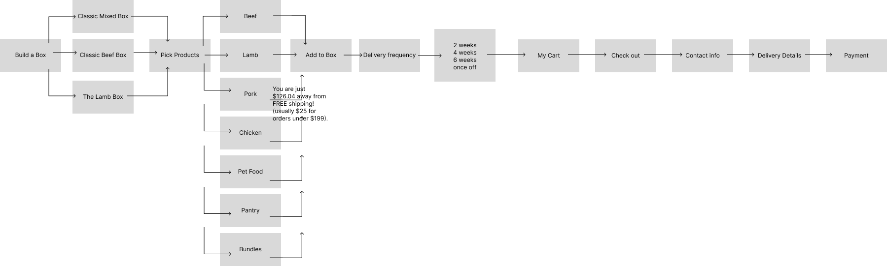
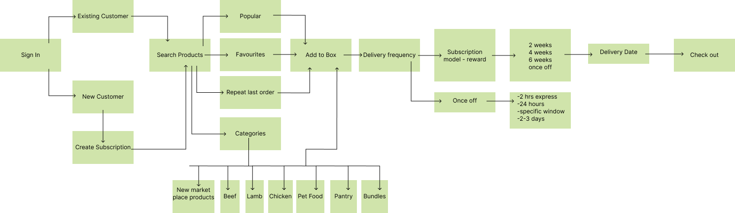
I also created two user journey maps to compare the current website user journey and the new user journey I was proposing for the app.
For the existing user journey of the organic food ordering app, users had to navigate through multiple screens and menus to place an order, resulting in a tedious and time-consuming process. To improve the user experience, I created a new user journey that simplifies the ordering process with a clean and intuitive interface, reducing the number of steps required to place an order and allowing users to easily customise their order.
Previous User Journey
New User Journey
Design
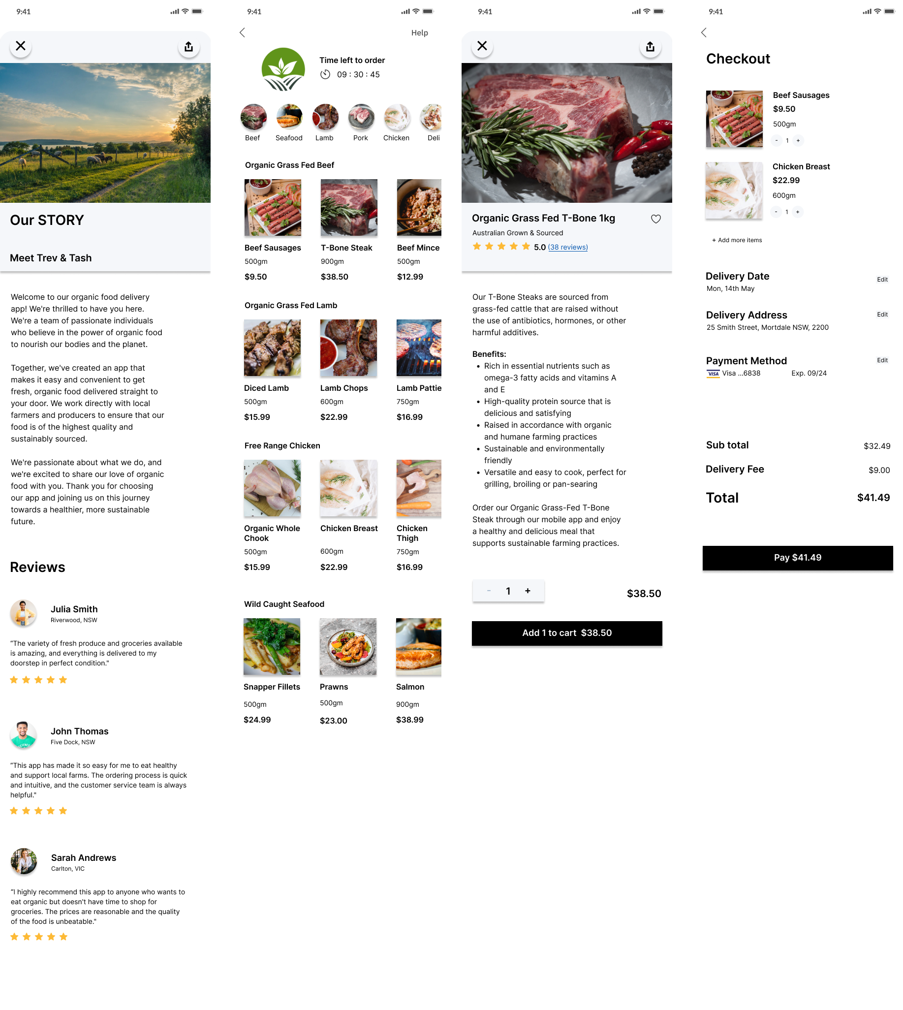
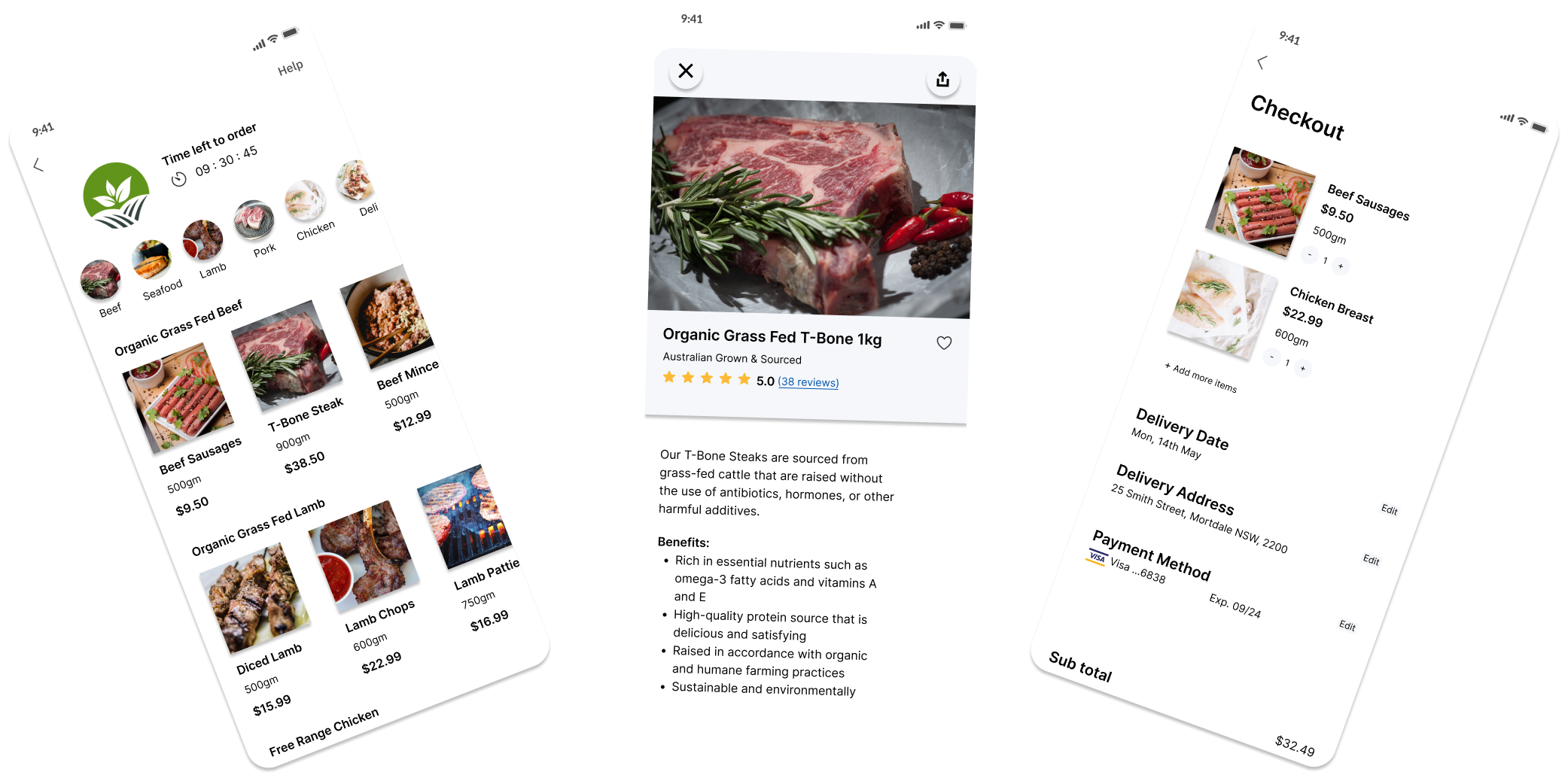
With the user research insights, I designed a user-friendly interface that made it easy for users to browse and find organic food items, add them to their cart and checkout seamlessly. I also included features such as personalised recommendations based on their previous orders, the ability to save their favourite items for faster ordering in the future and a real-time order tracking system.
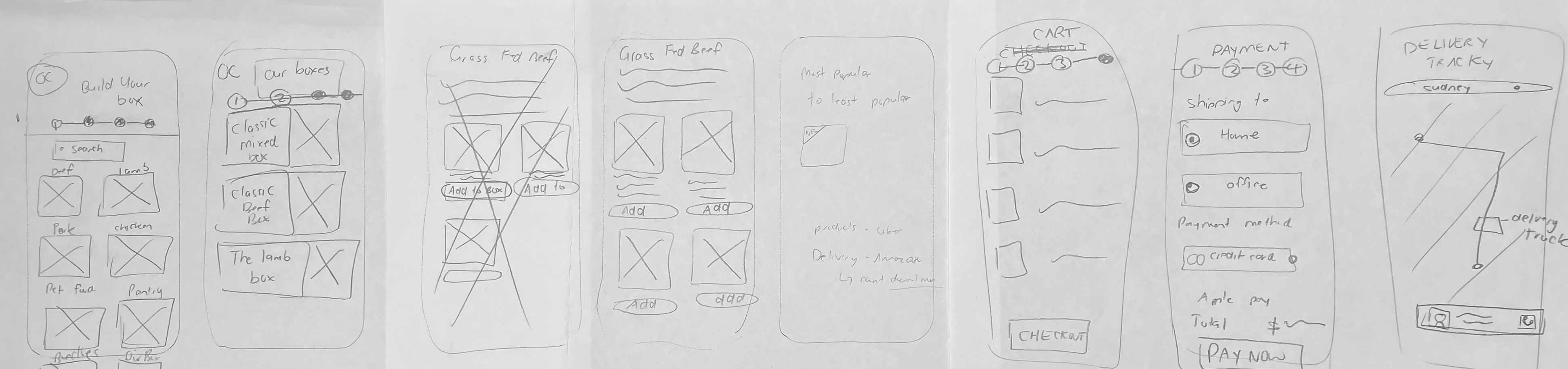
To begin the design process, I started by sketching out rough wireframes by hand. These hand sketches helped me to quickly iterate and explore different layout options for the interface, before moving onto more detailed digital wireframes.
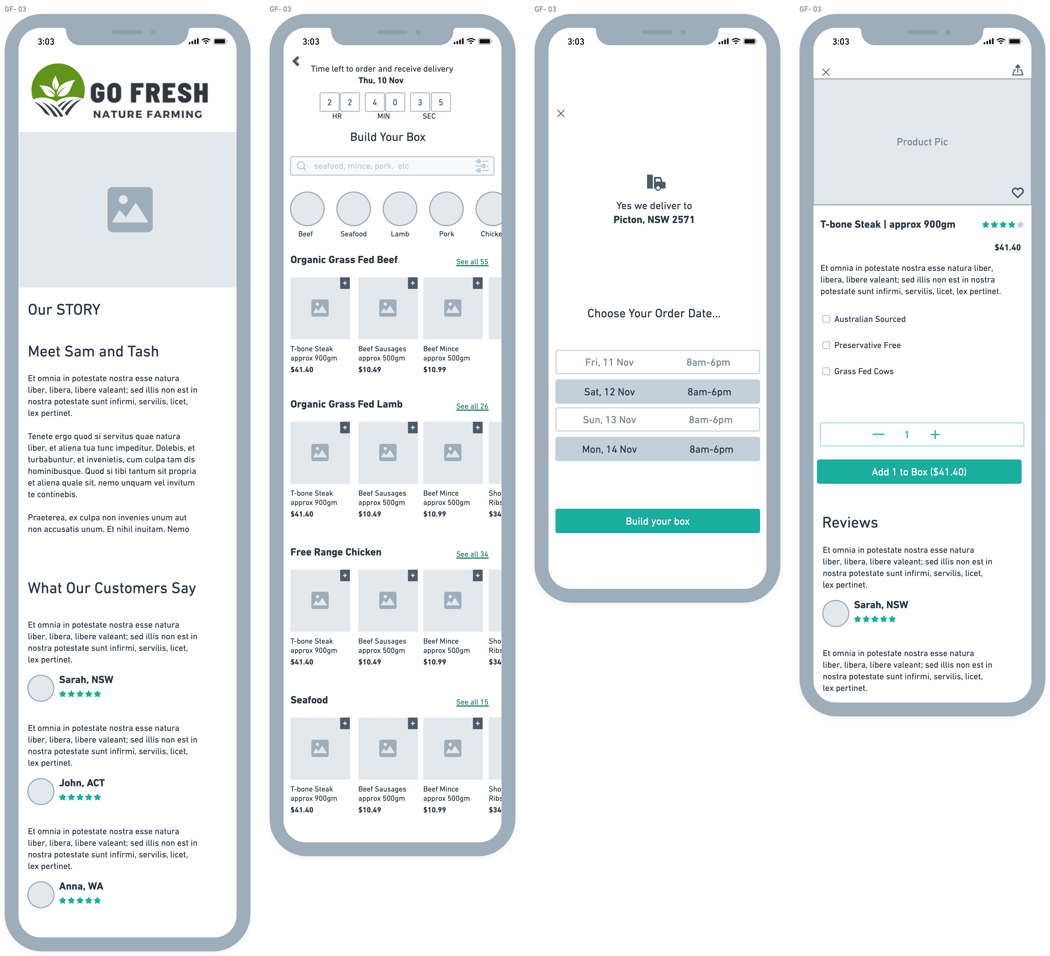
Using the hand sketches as a starting point, I then created low-fidelity wireframes using digital design software. These low-fi wireframes allowed me to flesh out the interface in more detail, while still maintaining a focus on overall structure and functionality.
Once the low-fi wireframes were finalised, I moved on to creating high-fidelity wireframes. These hi-fi wireframes included more detailed design elements, such as colour schemes, typography, and imagery, to create a more polished and refined interface design.
Hand Sketch wireframe ideas
Low Fidelity Wireframes
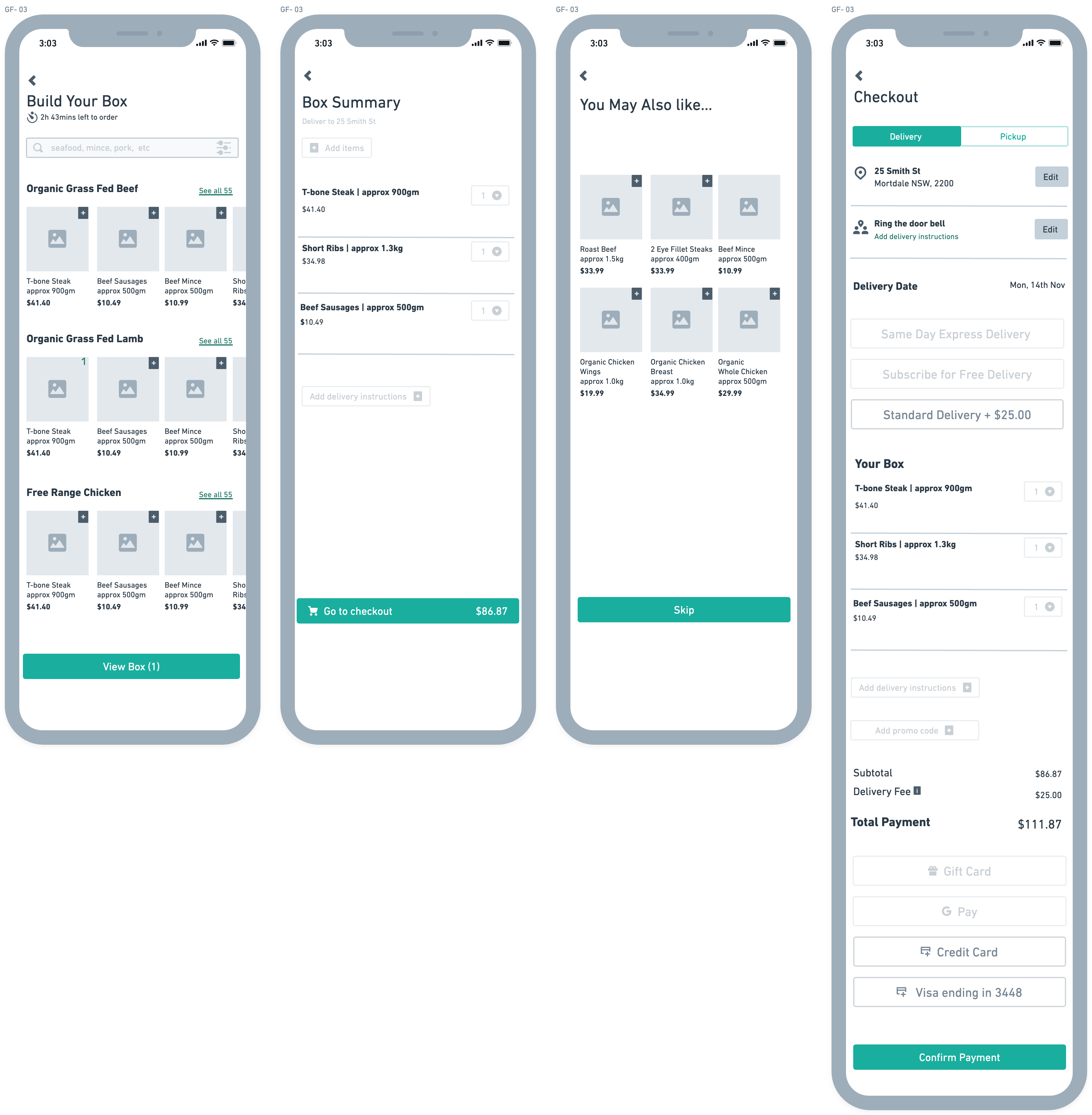
Hi Fidelity Wireframes
The key UI principles I focused on were consistency, using a cohesive colour palette, font styles, and button designs throughout the app to create a professional and seamless look.
To enhance the app's usability, I paid close attention to navigation and information hierarchy. By implementing clear hierarchies of information and intuitive user flows, users can easily find what they need and complete their orders without any confusion or frustration.
Visual hierarchy was another principle I used to design the app. I made sure to draw attention to important information by using larger fonts, bright colours, and visually appealing designs.