.svg)
No items found.
Creative Banner Assets
Banners are visual cues for important information and calls to action, which can help to increase engagement and improve navigation. Plus, effective banner design can contribute to the overall brand identity of a website and make it look even more appealing. Take a look at a few examples of my work in designing creative and effective banners for websites.
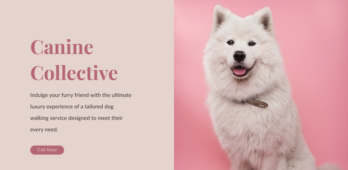
Luxury Dog Walking Service
When designing this banner, I wanted to convey a sense of exclusivity and high-end service that this dog walking company provides to its clients.
To achieve this, I selected a high-quality photograph of a well-groomed dog, with a shiny coat and a designer leash. The photo is placed on the right-hand side of the banner, drawing the viewer's attention and showcasing the company's commitment to luxury and style.
On the left-hand side of the banner, I used a modern serif font to display the company's name , "Canine Collective". This text is displayed in a contrasting color, making it stand out and reinforcing the company's message of exclusivity and quality.
To create a user-friendly design, I made sure to consider spacing and hierarchy. I used plenty of white space to separate the text from the photograph, making it easy for viewers to read the message. The hierarchy of information is clear, with the company name and t prominently and the call-to-action button "Call Now" placed directly underneath the descriptive text.
Overall, I'm really happy with how this website banner turned out. It's a friendly and inviting design that effectively promotes this luxury dog walking service and encourages pet owners to give their furry friends the best care possible.
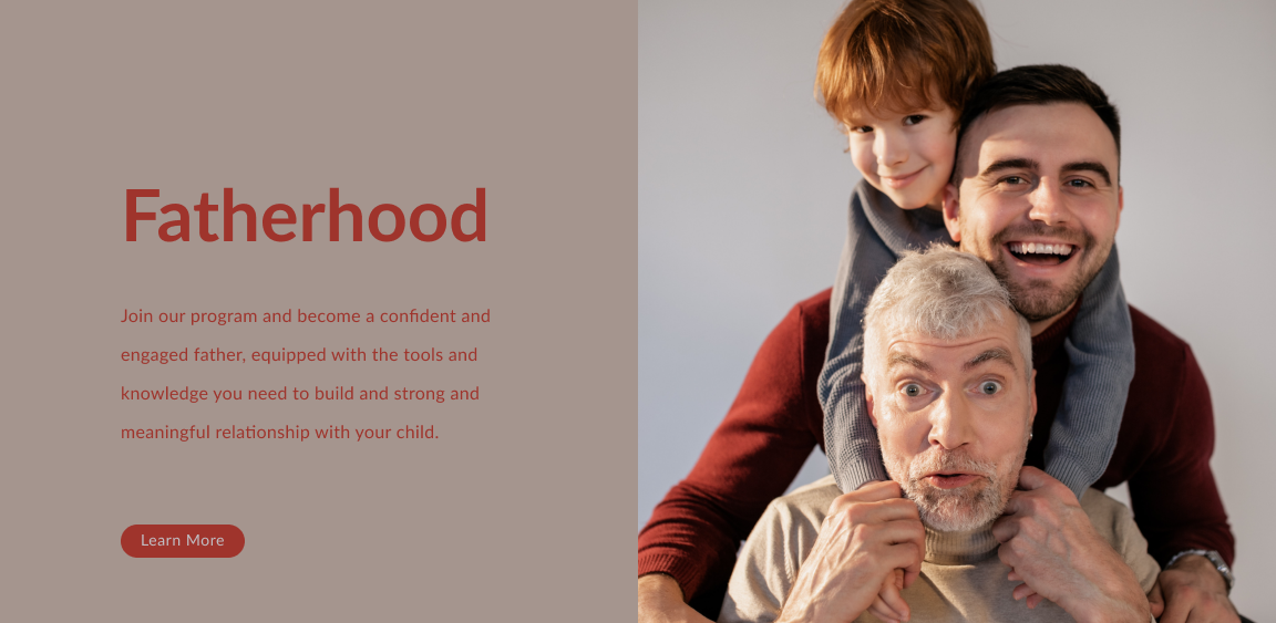
Fatherhood Course
I designed a website banner for a fatherhood course that successfully conveyed the theme of the course and created an emotional connection with the audience.
I chose a photo of three generations of men (grandfather, father, and son) to create a friendly and approachable image that instantly conveyed the importance of fatherhood across generations.
To complement the photo, I selected warm, earthy tones for the text on the banner, using a colour palette that included shades of burgundy, beige, and grey. This created a harmonious look and feel while conveying a sense of stability and reliability, which are important qualities for a course on fatherhood.
In terms of UI concepts, I made sure the banner was responsive and looked great on all screen sizes by using a layout that adjusted to different screen widths and keeping the text and image size in proportion. I also prioritized the hierarchy of information on the banner by using a clear and concise message that emphasised the most important information, such as the course title, date and time, and call to action (e.g. "Register Now").
Overall, I created a website banner that was not only visually appealing but also effective in getting people to sign up for the course. By using a great photo, complementary colours, and strong UI concepts, I was able to create a banner that captured the attention of potential attendees and encouraged them to take action.
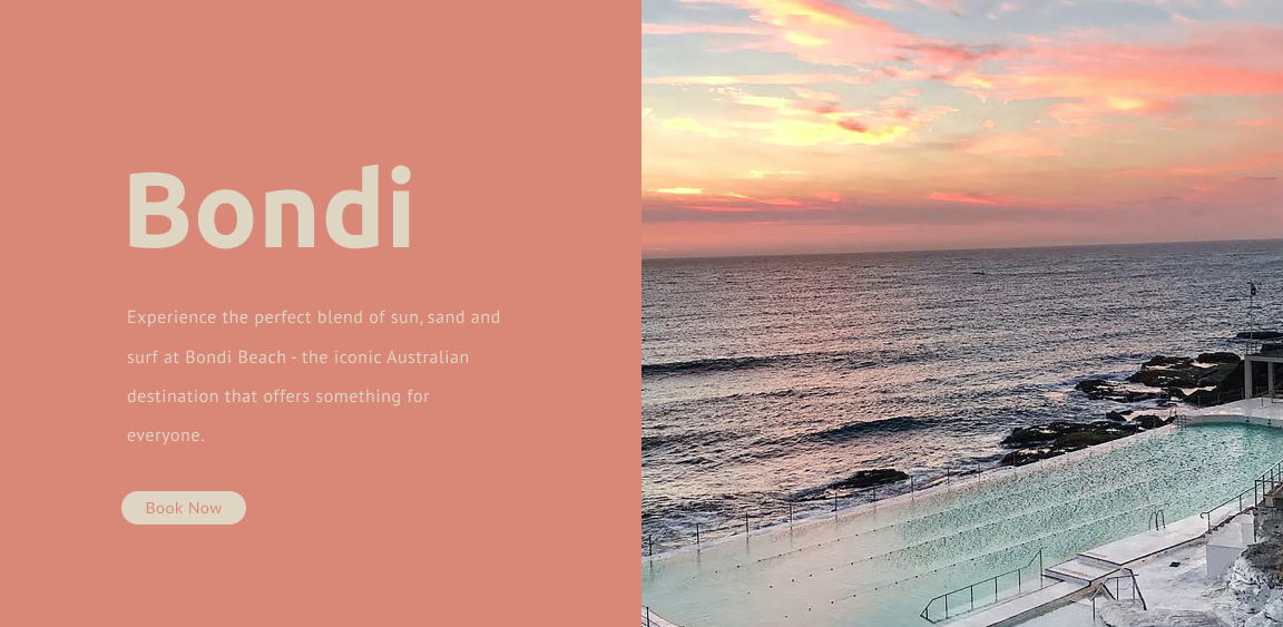
Bondi Beach
I had so much fun designing this banner! I mean, how could you not get excited about promoting one of the most beautiful beaches in the world? I wanted to create something that would capture the essence of Bondi and make people feel like they just had to go there.
So, I started by choosing a photograph that would blow people's minds. I found a stunning picture of the sunset over Bondi rock pool and knew it was perfect.
Next, I played around with fonts until I found one that gave me the vibe I was going for. I settled on a sans-serif font that was modern and approachable. I used it to create a heading that said "Bondi" and a short paragraph that highlighted all the amazing things about the beach.
Then, I added a call-to-action button that said "Book Now". I mean, why wait when you could be soaking up the sun on Bondi Beach right now?
When it comes to UI concepts, I made sure to consider spacing and hierarchy to make everything look easy on the eyes. I wanted the photograph to be the star of the show, so I gave it plenty of space.
Then, I used contrasting colours and made the call-to-action button stand out .
In the end, I think I created a banner that is both visually stunning and user-friendly. It makes me want to drop everything and book a flight to Bondi right now!
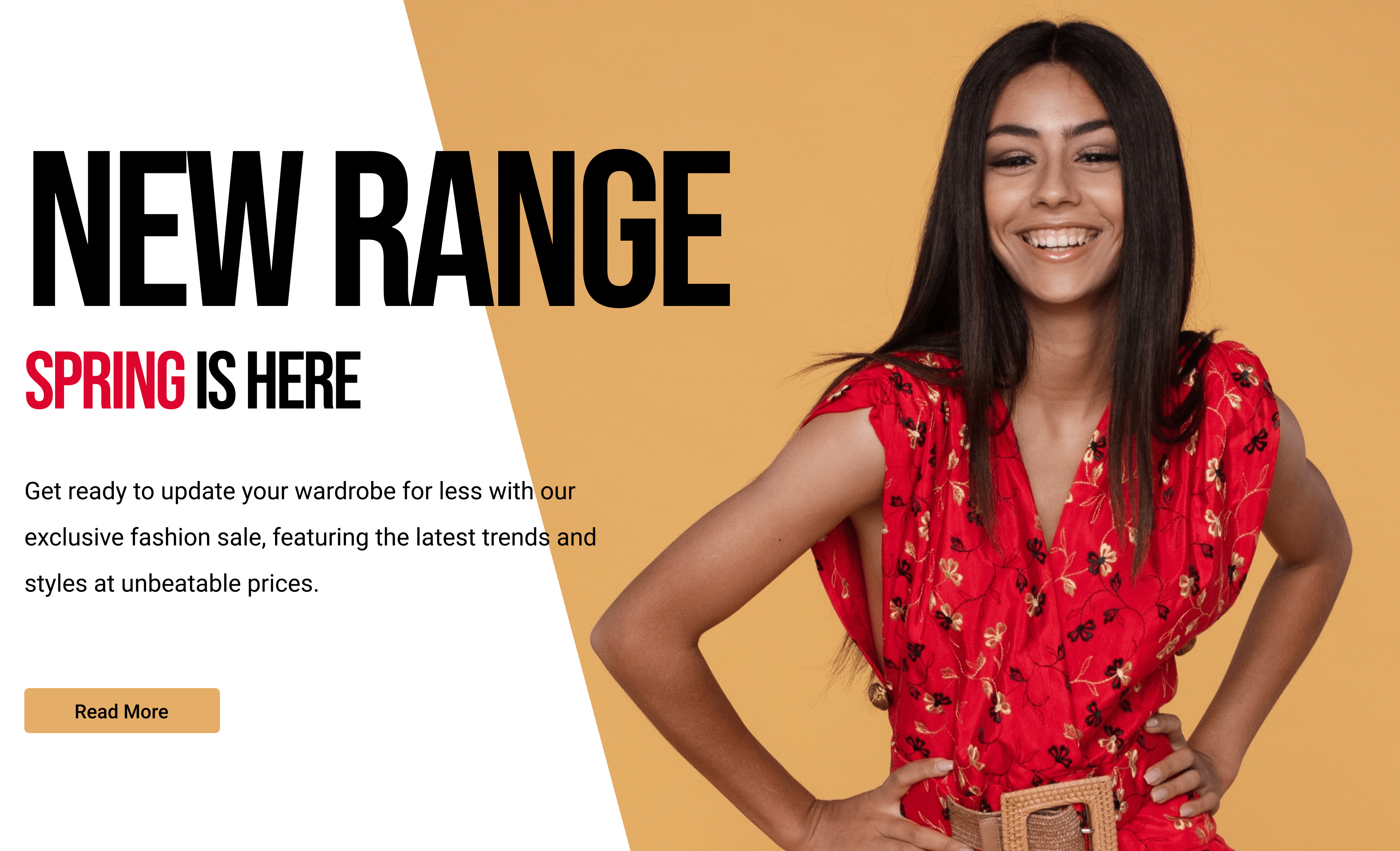
Fashion Label Advertisement
When it comes to designing a web banner ad for a fashion company, it's all about capturing attention and communicating the brand's message effectively. That's exactly what I aimed to do with my design! The first step was to think about the purpose of the ad and the target audience. I knew I wanted to promote a new collection or sale event to fashion-forward women aged 25-45.
With that in mind, I chose a colour scheme that would resonate with the target audience and reflect the brand's message. The soft orange and white background creates a warm and inviting atmosphere, while the lady in the red dress adds a bold and striking contrast that's sure to catch the viewer's eye.
But the design isn't just about looks! I made sure to use bold text that communicates the brand's message clearly and concisely. The goal is to encourage the target audience to take action, whether it's clicking through to the website or checking out the collection in-store.
Overall, I'm really proud of this web banner ad design. It's striking, bold, and inviting all at once. And with clear and concise text that gets straight to the point, I'm confident that it will effectively promote the brand and encourage engagement from the target audience.