.svg)
No items found.
Chat App- Landing Page Design
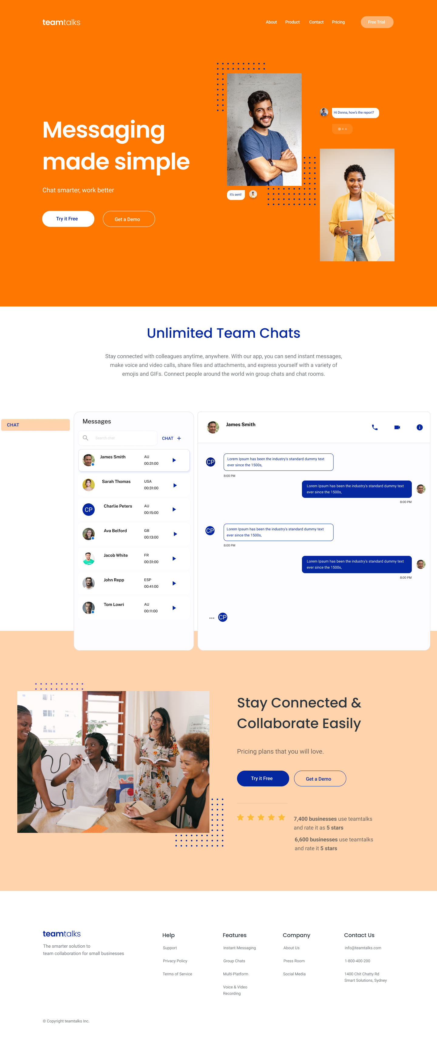
Let me tell you about the landing page I created for my client's messaging app, Team Talks. The goal of the page was to showcase the app's benefits as a simple and effective way to communicate in the workplace.
To start, I chose a modern and clean design that would make it easy for visitors to understand what Team Talks is all about. The prominent background colour is orange and white with compliments of navy, which gives the page a professional yet approachable look. I used a white san-serif font that is easy to read, making the content clear and engaging.
To showcase the benefits of the app, I used a combination of photographs of individuals and groups at work and screenshots of the app in action. This helps visitors to visualise how the app works and how it can help them stay connected with their colleagues, no matter where they are.
In terms of the layout, I placed important calls-to-action (CTAs) throughout the page to encourage visitors to take action. The two most important CTAs - "Try It Free" and "Get a Demo" - are prominently displayed, making it easy for visitors to sign up and learn more about the app.
The header navigation and footer are also clean and simple, making it easy for visitors to find what they're looking for and navigate the page. Overall, I'm really happy with how the landing page turned out. It effectively communicates the benefits of the app, showcases its features with engaging visuals, and makes it easy for visitors to sign up and get started.